
Women’s Running Magazine:
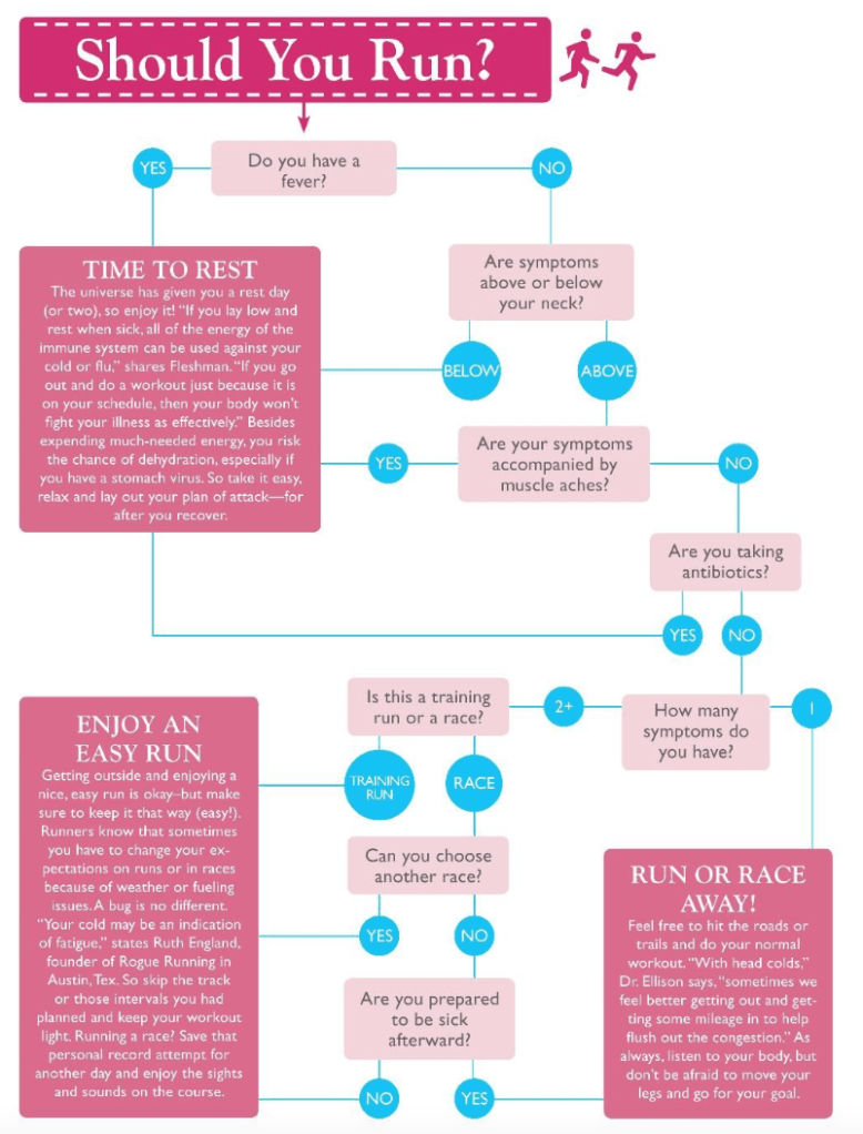
I found the first infographic from Pinterest, created by Women’s Running Magazine. I chose it because I thought the topic is something everyone contemplates at one point, but never really talks about. There have been many times when I debate whether or not I should run depending on how I feel. There have been times when I’m getting over a sickness, and sometimes a light run is the last thing I need to get over it. Other times, it makes it worse. This chart is helpful when figuring out how you feel.
I find this infographic to be effective for what it is made to do. The main reason I chose it was because of the choose your own adventure aspect. I think it’s different and it’s more interactive and fun for people to read. It kept me engaged the whole time. The lack of visuals kept the overall look very clean and straight to the point. I want to take that aspect into my infographic. The simpler and more straightforward the infographic is, the more people will read (and hopefully learn) from it.
The Running Clinic:
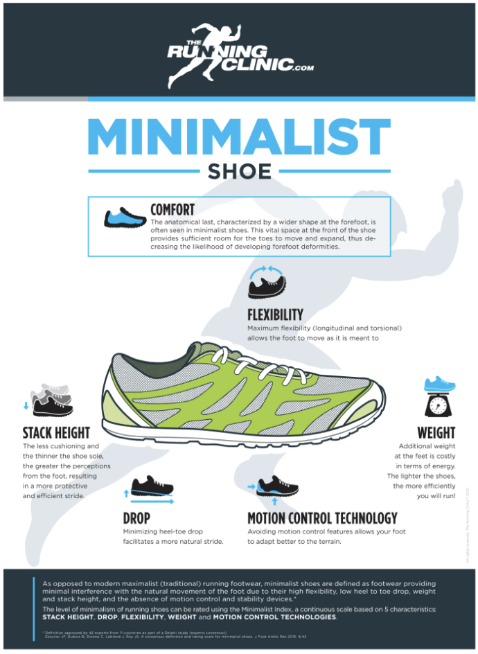
What stood out to me from this infographic was the use of minimal, but large, images and visuals. It makes it easy to read and understand in a short amount of time. For me personally, if an infographic has too many words in small font, I won’t read it. I like this one, made by The Running Clinic, does a good job at being informative but not boring. Which can be difficult sometimes depending on the information.
Something I want to incorporate into my infographic from this one is the use of a focal image. Using a large image can demonstrate to the reader what the point of the infographic is with no words. The tricky part with that is how to keep the reader engaged after that. The use of smaller images with a paragraph underneath did a good job at keeping it interesting and easy to understand.

Leave a comment